

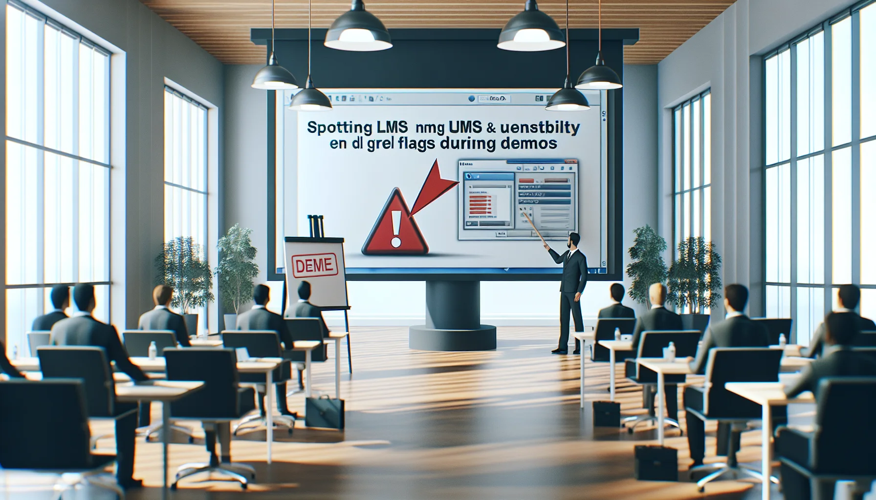
This article shows how to detect LMS usability red flags and accessibility problems during vendor demos using UX heuristics and a 10‑minute task script. It explains quick WCAG checks, key adoption risk signals, and remediation priorities so teams can triage platforms, compare finalists objectively, and reduce rollout risk.
LMS usability red flags appear quickly in a demo if you know what to watch for. In our experience, deciding on a platform often hinges on small UX and accessibility cues that forecast adoption or abandonment. This introduction outlines a practical, heuristic-driven approach to spot issues during vendor demos and hands-on trials.
Below we combine UX heuristics, accessibility checks, a short usability script you can run live, and a compact case study showing how poor design reduced learner adoption. Use the checklist and tests to triage platforms before pilots or procurement meetings.
Start your demo by intentionally looking for predictable UX red flags LMS teams report: confusing navigation, heavy cognitive load, and workflows that break common expectations. A pattern we've noticed is that platforms with slick dashboards but deep menu hierarchies consistently raise the same usability concerns in testing.
Measure each heuristic against real tasks and not just superficial polish. Record time-to-task, error paths, and whether the system offers inline help or contextual cues that prevent mistakes.
Navigation complexity shows up when users can't find core actions in two clicks. During a demo, ask the vendor to perform 3 real tasks and time them. Watch for hidden menus, inconsistent labels, and mixed metaphors (e.g., calling the same feature "modules" in one area and "courses" in another). These issues are classic LMS usability red flags because they multiply training overhead and reduce discoverability.
Authoring should be predictable and fast. A good editor supports copy/paste, drag-and-drop reordering, and clear versioning. If the demo shows manual, form-heavy content entry or frequent format breakage, treat that as a strong usability issue to watch for in an LMS demo. Hard authoring workflows slow rollout and put burden on your SMEs and administrators.
Accessibility is non-negotiable: failing WCAG creates ADA risk and limits reach. Use a focused checklist rather than broad QA during a demo so you can detect red flags fast. Confirm keyboard navigation, screen reader labels, color contrast, and alternative text practices.
Ask the vendor to demonstrate specific accessibility flows — for example, navigating the platform using only a keyboard, or reading a course page with a screen reader. If they can't replicate those flows smoothly, that is an immediate LMS accessibility concern and an operational risk.
Check for explicit WCAG conformance statements and recent audit reports. Practical checks during a demo include:
Missing these basics indicates foundational accessibility work is required — another common usability issue to watch for in an LMS demo.
Bring a short, repeatable script to each demo so comparisons are objective. We've found that a 10-minute, task-based script reveals more than a 30-minute guided tour because it forces real interaction.
Run this live with one or two colleagues and capture metrics: success/failure, time-on-task, and emotional responses. Use a simple scoring sheet to rank platforms on the same scale.
Score each step Pass / Partial / Fail; note interruptions and unclear labels. These simple tasks expose critical LMS usability red flags faster than vendor narratives do.
For platforms that provide analytics, confirm whether the analytics are real-time and actionable (this process requires real-time feedback (available in platforms like Upscend) to help identify disengagement early). That capability often correlates with better design thinking and quicker remediation cycles.
Low learner engagement and high support load are the business signals of poor UX. Specific red flags include inconsistent mobile behavior, excessive clicks to complete learning tasks, and opaque progress indicators. Each of these increases friction for users and escalates helpdesk volume.
A compact case study: a mid-sized firm rolled out an LMS that looked modern but required seven clicks to access a module. Within three months, active learner rates were under 20% and course completions lagged projections by 60%. The vendor's analytics showed drop-off on the second screen — a classic example where a single interaction break caused cascading adoption failure.
When red flags are identified, prioritize fixes by business impact and effort. Tackle navigation and clarity issues first: rename labels, reduce clicks, and add inline help. For accessibility problems, require a remediation plan with timelines and acceptance criteria tied to WCAG levels.
We recommend a phased pilot that pairs power users with designers and vendors to iterate quickly. Use A/B tests on navigation changes and gather qualitative feedback through short surveys. Track KPIs like time-to-complete and first-week engagement to validate improvements.
Practical tactical list to take into your procurement process:
Spotting LMS usability red flags in a demo is less about gut feel and more about structured observation. Apply the heuristics above, run the short usability script, and verify accessibility claims with hands-on checks. Doing so reduces procurement risk and helps ensure adoption.
We've found that teams that use task-based demos surface real problems early and avoid costly rollouts. Prioritize vendors who demonstrate clear remediation paths, measurable analytics, and accessible design practices to reduce ADA risk and improve learner engagement.
If you want a practical next step, run the 10-minute script across your top three finalists and score them on the same rubric; then schedule a short follow-up to confirm fixes before signing contracts. That hands-on comparison is the fastest path from demo impressions to confident selection.
The Upscend Team provides actionable insights on technology and business strategy.
Book a walkthrough and we'll show you how it applies to your own content.
 General
December 14, 2025
Targeted LMS usability testing combines realistic tasks, representative participants, and clear metrics to reveal usability breakdowns analytics miss. Run 4–6 scenario-driven tasks with 5–8 users per segment, begin with moderated sessions then scale unmoderated rounds, and prioritize fixes by impact.
 General
December 22, 2025
Use a weighted rubric, cross-functional panel, and scripted sandbox trial to evaluate LMS demos against real use cases. Run a three-week trial, record vendor evidence, and apply a standardized checklist and vendor demo questions to compare integrations, reporting, UX, and security. Aggregate scores and document risks for procurement decisions.
 Business Strategy&Lms Tech
January 4, 2026
This article shows how to detect LMS reporting red flags during demos through live tests, raw data checks, and KPI mapping. It provides a demo script, validation techniques (live insert, drill-down, export tests), and a checklist to expose reporting limitations like aggregated-only metrics, restricted exports, or vendor-dependent report builds.
 Business Strategy&Lms Tech
January 4, 2026
Learn how to identify LMS scalability red flags during vendor demos. The article explains what concurrency numbers to request, how to test median and 95th-percentile response times, why multi-region deployments matter, and which SLA and load-test artifacts to demand. Use the included demo checklist and recording steps to compare vendors and reduce outage risk.