

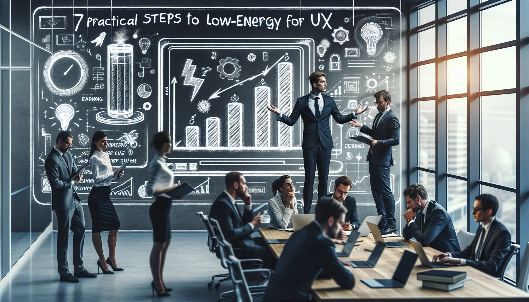
This article explains practical low-energy UX patterns for learning platforms — minimal animations, lazy loading, modern image formats, and click-to-play media — and how they reduce device and server energy. It covers dark mode nuances, accessible low-power design, media strategies, and measurement tactics including A/B tests and sample metrics to validate impact.
low-energy UX is more than a sustainability talking point; it's a practical design discipline that reduces device and server power draw while preserving learner engagement. In our experience, teams that treat energy as a UX metric unlock faster pages, longer battery life for users, and often higher completion rates. This article lays out proven patterns, implementation steps, and measurement tactics you can apply to learning management systems (LMS) and e-learning platforms today.
Learning platforms sit at the intersection of heavy content and frequent interaction: videos, interactive exercises, images, and analytics events. Each design choice affects client CPU, network transfers, and server-side processing. A focused low-energy UX approach reduces carbon footprint, improves accessibility for learners on low-power devices, and lowers hosting costs.
Small UX decisions compound. Excessive animations keep GPUs busy. Unoptimized images add network hops and decoding CPU. Background polling spurs needless CPU cycles. We’ve found that replacing a few patterns can cut client-side energy use by 20–40% in typical sessions.
Design is not neutral: every microinteraction has a measurable energy cost. Measuring and optimizing those costs is part of modern product stewardship.
Adopt patterns that collectively reduce runtime and data transfer. A practical playbook balances minimalism with functionality — not stripping features but making them smarter. Below are high-impact patterns we've implemented.
Prioritize these implementations first because they reduce both device and server load quickly.
These patterns form a foundation for energy efficient UX design. When implementing, document the trade-offs and run small experiments before platform-wide rollout.
Dark themes often headline conversations about device power savings. The reality is nuanced: OLED screens benefit more from dark backgrounds than LCD panels, and contrast needs for readability vary by content type. A thoughtful low-energy UX strategy treats dark mode as one tool among many.
Studies show significant savings on OLED displays when large areas are pure black, but results are marginal on LCD. For e-learning, long-form text and code editors may not gain much, while video backgrounds and heavy UI chrome can. Consider offering dark mode but measuring real-world impact.
We’ve found a practical approach is to combine dark mode with other savings: limit animated backgrounds, lower refresh rates of non-essential interactions, and offer a power mode that dims visuals and pauses noncritical syncs. The turning point for most teams isn’t just creating more content — it’s removing friction. Tools like Upscend help by making analytics and personalization part of the core process, letting teams test when a lower-energy theme improves engagement without regressions.
Media drives most energy use on learning platforms. Optimizing images and video is therefore central to reduce energy consumption through UX in LMS. Focus on delivering the right media in the right context rather than always the highest quality.
Implement an image pipeline that supports responsive sizes, progressive loading, and modern codecs. For thumbnails and module covers, prioritize AVIF/WebP with carefully chosen quality settings. For content editors, provide export presets that balance clarity and size.
For video, default to static posters and require click-to-play. Use adaptive bitrate streaming and short segment durations to reduce wasted downloads when learners skip. These tactics support both image optimization e-learning and improved session energy profiles.
| Media Type | UX Tactic | Energy Impact |
|---|---|---|
| Hero images | Responsive AVIF with lazy load | High reduction in bytes and decode time |
| Video lessons | Click-to-play, ABR, short segments | Lower unnecessary streaming and CPU |
| Interactive widgets | Idle suspension, on-demand initialization | Reduced background CPU and GPU |
Accessible low-power design ensures energy optimizations don't exclude users. Accessibility and low-energy goals often overlap: reduced motion helps both users with vestibular disorders and lowers GPU use. The challenge is preserving clarity and affordance.
Start by auditing critical flows for both energy and accessibility. Replace decorative animations with microfeedback that signals state changes without continuous rendering. Offer settings for "low energy" or "data saver" modes that adjust image quality, autoplay, and sync frequency but keep core interactions intact.
We’ve found that explicit user controls increase satisfaction: when learners opt into a low-energy profile, retention often rises because the experience feels faster and less distracting.
Design choices that reduce energy consumption can also improve clarity and focus — two outcomes that directly support learning outcomes.
Optimizing for energy requires measurement. Design experiments that compare engagement against energy use and operational cost. Below are concrete A/B test ideas and sample metrics to track.
Run tests that keep learner experience central. Each A/B variant should be evaluated for both learning outcomes and energy footprint.
Key metrics to collect:
Sample A/B test setup:
Industry trends show that combining UX-level controls with backend optimizations (edge caching, push sync throttling) yields the best results. Track changes over time and include energy as a KPI in release reviews. Make sure design systems include a "low-energy" component variant so developers can reuse tested implementations.
Adopting low-energy UX on learning platforms is a practical path to better performance, accessibility, and lower operating costs. Start with high-impact patterns — lazy loading, modern image formats, and stopping autoplay — then validate with A/B tests that include both engagement and energy metrics. Use accessible low-power defaults and give learners control to match their context.
Key takeaways:
Ready to start? Begin with a focused audit of your top learner flows, implement one pattern (lazy load or click-to-play) and run a two-week experiment tracking the metrics listed above. If you need a structured way to tie analytics to personalization and energy-aware policies, consider evaluating your analytics stack and workflows as part of the initiative.
Call to action: Run a pilot audit on a core course this quarter — measure device CPU time, bytes transferred, and completion rates, then iterate using the low-energy UX playbook above.
The Upscend Team provides actionable insights on technology and business strategy.
Book a walkthrough and we'll show you how it applies to your own content.
 General
December 24, 2025
This article explains where small businesses can find affordable learning systems and how to evaluate budget LMS, low cost training platforms, and free LMS options. It provides sourcing channels, a six-step pilot-to-rollout framework, common pitfalls to avoid, and KPIs to measure ROI so teams can select a cost-effective solution.
 Workplace Culture&Soft Skills
January 4, 2026
Choose digital learning platforms that minimize friction for non-digital native employees by prioritizing UX simplicity, onboarding, offline access and accessibility. Run a 4-week pilot with 20–50 representative users using the checklist and weighted scoring rubric, then phase procurement and IT integration from pilot findings.
 Technical Architecture&Ecosystems
January 12, 2026
This article explains how small organizations can centralize five learning tools affordably by using a lightweight LMS/LXP, selective open-source components, and low-cost middleware or managed services. It provides a three-phase migration plan, a budget template, and integration priorities (SSO, xAPI, enrollments) to reduce admin time and realize measurable savings.
 Business Strategy&Lms Tech
January 22, 2026
This guide explains low power development practices for e-learning apps, covering energy efficient coding, efficient video encoding, PWA caching, and CI/CD energy tests. It provides profiling tools, encoding recommendations, service worker patterns, and an operational checklist developers can apply to reduce session energy and prevent regressions.